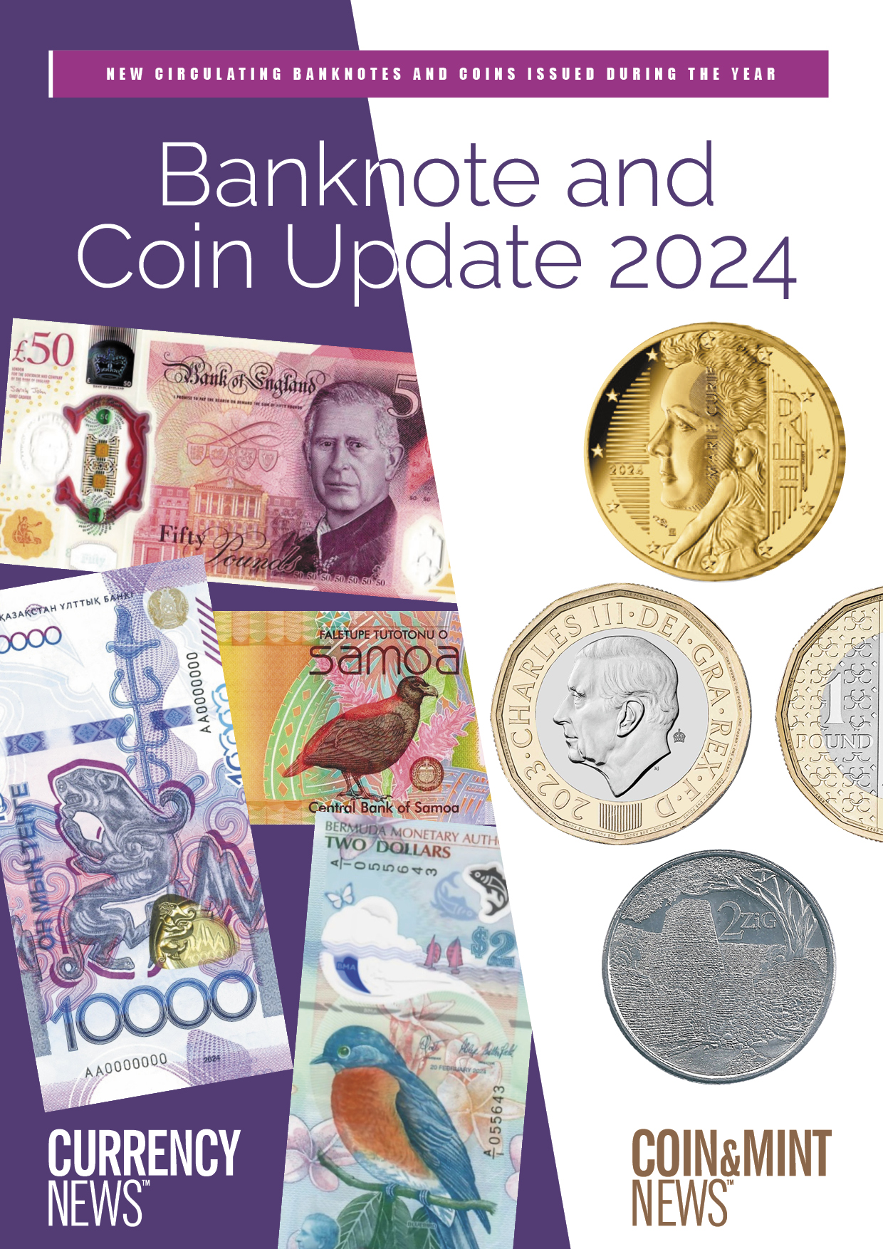

The Bank of England (BOE) and the European Central Bank (ECB) have both started the process of designing new banknote series. With counterfeiting levels low, the rationale for these new series seems to lie in a wish to ‘renew’ and ‘reinvigorate’ people and the idea of the nation (UK) or community (Europe). To deliver this, playing it ‘safe’ risks failure. Can the designers rise to the challenge?
The ECB is further ahead in its process and has invited designers to apply to take part in a design contest, having already selected two themes – ‘European Culture’ and ‘Rivers and Birds’.
The BOE is a step earlier in the process and is inviting public ideas on potential themes, which include notable historical figures; nature; architecture and landmarks; arts, culture and sport; noteworthy milestones; and innovation.
At the launch of the BOE consultation, Victoria Cleland, the Bank’s Chief Cashier, said that ‘banknotes are more than just an important means of payment. They serve as a symbolic representation of our collective national identity and an opportunity to celebrate the UK’. A much used phrase is that a banknote is the ‘calling card of the nation’.
All very earnest (and true). But it also hides a challenging task at a time when politics around the world seem to face increasingly fragmented societies with entrenched views and little appetite for compromise.
Because despite statements to the contrary, banknotes are – essentially – political.
The US, for example, started planning a new series in 2011, with one denomination in particular causing problems. A decision had been made to put the portrait of former slave and renowned abolitionist Harriet Tubman on the $20 banknote in place of President Jackson, which would make her the first woman and first African-American on a US note. President Trump’s first administration delayed the planned issue date, and it is now planned for around 2030.
Political and societal tensions over race and gender (by no means unique to the US) are being played out in the debate over this banknote.
The problems are compounded when more than one country is involved. The ECB avoided imagery relating to specific people or places in the first series, going instead for abstract bridges and windows, at a time (in the 1990s) when national figures held sway on most countries’ banknotes. Thie time round, if the Europe Culture theme is selected, it begs the question – is there such a thing as a pan-European culture (and if so, what).? Or will the banknotes seek to engender that sense of culture? Both scenarios are political. Rivers and birds not so much.
But there is a broader question than just design: namely, in the context of a rise in payment by card, contactless and mobile wallet, why redesign new series at all? Is there a link between design and usage?
In the UK cash use has fallen to 12% of transactions – it was 51% ten years ago – but the BOE says it is committed to providing cash for those who wish to use it.
The ECB’s 2024 Study on the Payment Attitude of Consumers in the Euro Area (SPACE) showed strong support for being able to pay with cash (62% saw this as very or fairly important).
It is impossible to know how much of this is down to a fondness for the design and physical product itself, but there is evidence that the public won’t use a design or denomination that they don’t like. In the US, the $2 banknote is seldom used; similarly in Japan, the 2,000 yen note. In the UK, most people turn their noses up at the £50.
Consultation is a useful tool to engage and educate the public about and with a planned new design. As the process proceeds, it can also be useful to know that the aesthetics of the project are on track.
A great design is good for the country, good for the central bank and vital for the currency itself. But, and there is always a but, public consultations haven’t always gone well in the past.
In 2016, the UK’s Natural Environment Research Council asked the public to name a new polar research vessel. On the internet the public overwhelmingly voted for ‘Boaty McBoatface.’ The name was unsurprisingly rejected for the ship itself (which became RRS Sir David Attenborough after the famous naturalist), but the name lives on in a submersible robot.
It isn’t just in the UK that these things happen. A police department in Kansas asked the public to vote on a new mascot, and the people chose a goat named ‘Officer Billy.’ On that occasion the department embraced the chaos, and it now uses the goat in community outreach.
The Central Bank of Curaçao and Sint Maarten has recently created a new series of banknotes. In fact, it was the launch of an entirely new currency. Interestingly, it expressly chose not to run a consultation, stating that introducing a currency for two separate countries within a tight timeline, against a background of scepticism about the need for a new currency at all, was already complicated enough.
And there is much to be said for avoiding ‘design by committee’ (or, in this context, design by country or even community), pejorative phrases for a process that seldom works. The ideals of collaboration, democratic expression and stakeholder engagement are all very well, but design is both creative and subjective, and overinvolvement by multiple parties takes time, involves compromise and does not necessarily produce the best results.
In the case of the Caribbean guilder, a small design team involving the central bank and the suppliers (Crane and the Royal Canadian Mint), ended with a beautiful, evocative and meaningful series of notes and coins that won the approval of the people and Best New Series at the HSP Latin America awards in June. The public was involved in the run-up to the launch, and afterwards. But not before that.
Perhaps they are the sensible ones?
After all, if the public does what the public tends to do, and the powers-thatbe listen to them, we could end up with Notey McNoteface.